Last week, an author I’ve worked with, H. Prescott Lemon, released a novel for which I drew the cover. You might recognize the name from one of our guest articles, Unearthing Your Creative Origin Story. I’ve been working with Mr. Lemon, and his band the Underlords of the Overworld, for about a year now. We’ve put out album art (with more to come), and now Smaller Than Death is available for readers everywhere.
This is a journey newsletter. I do my best to keep this from becoming a sales endeavor. But, of course, I think you should pick up the book, especially since it has Brimstone Studios art on it! However, seeing this cover promoted got me thinking about the journey I’ve had creating covers. I have designed five comic book covers, a coloring book cover, a music album cover, and now this novel cover. I like cover work a lot, and I think I’ve come a long way. Hell, when I think about it, I’m discovering I’m a cover enthusiast. My first ever credit was offering Adobe consulting to a little ska band, Before Twenty, when they created their album, The Anticipointment.
Music is a great avenue for this exploration. Not only is our home collection of records growing, I’d argue a good portion of owning records is admiring them, including their cover art. When I was in high school, I was stagnant in my music taste. I hadn’t opened my heart to ska, and I didn’t know how to talk about, or find, jangle-pop. (It’s a genre, I promise) Weird Al saved me from the boyband era, and I was lost. Nu Metal was all the rage, and I had fun like the rest of the early 00’s kids, but it never stuck. Luckily, I had a friend, Jory, who hung album art all over his bedroom. In one corner of his arrangement hung a painting, Sisters of Mercy. You might know it better as the album art for Live’s Throwing Copper.
We really shouldn’t judge content by its cover, but we do. Sisters of Mercy is a haunting piece, and in that musical era, Live harnessed a haunting quality that matched it well. They quickly became my favorite band for the better part of two decades. The dark and heavy vibe in their music only grew more in their subsequent album, Secret Samadhi. It impacted me so much, I created my first ever album art as a parody to that album. While I regret that I don’t have a photo to share, it still hangs in my parents house on the door to what was once my bedroom. Somehow it took H. Prescott Lemon’s pulp novel dropping to reveal my history with cover work to me.
It would be several years until I created a new cover for anything. The next release became the first-ever cover to my comic series, Champions. The cover aimed to show readers the four main characters, a hint of the city, and offer the viewer the mystery of the cross-like imagery I was utilizing. I have a soft spot for that cover, even if I can see how my work has evolved since those days.
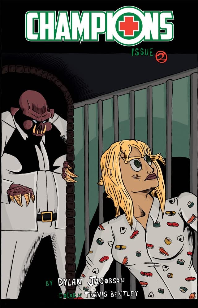
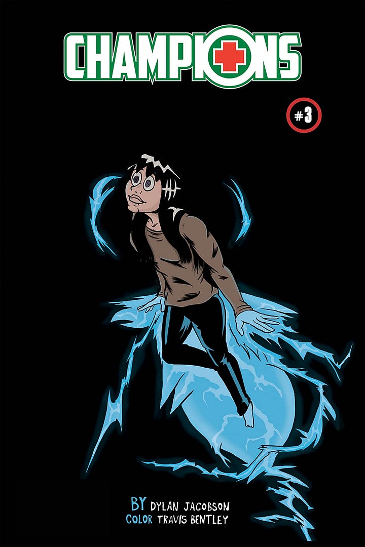
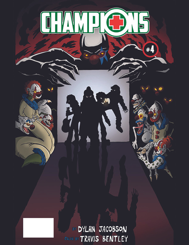
Champions is a series, and each issue needed a new cover. I designed a cover for issue two, featuring the character, Alex, and the villain, Piggy. I wanted it to look like a classic horror movie cover. Think The Mummy, or Dracula. The third issue focused on tragedy, and I illustrated a character, Mary, centered on a black background. The fourth issue was the raising of stakes for the story, and I featured all four heroes surrounded by monsters. My final Champions cover was a representation of one of the main character’s journals for issue six, as the series concluded. They each felt different, and showcased a whole lot of change in my work.


Along the way, I worked on pieces like Together With Goblins, my coloring book. It has a youthful and arguably traditional coloring book cover. I think, at that point in my career, a cover was just something you have to have on a book. I wanted to focus on the interior and put as little thought and energy into covers as possible. I hadn’t considered how album art conjures to my mind when I think about the music I love, or how certain book covers sit with me when I think about the books themselves, or how movie cases tell me everything I need to to conjure each scene in my mind. There’s still so much of me that loves every aspect of storytelling. But lately, I’ve started to realize my appreciation for covers and I want to do so many more of them.
It’s an honor to work with folks like the Underlords and H. Prescott Lemon. They’ve asked me to create pieces that are meant to do for their audiences what Sisters of Mercy did for Live. In the instance of Smaller Than Death, I am not the first artist to represent these characters. A portion of the job is to prepare an evolutionary avenue for the artwork to nod to the original designs, while stepping toward the heavier inks of my style. It wasn’t just to create a crazy spider, I needed intention to follow directions and confidence to step into new directions for the author. I had to hold onto those goals while also striving to make something striking that tells you this is a pulp novel, and a cool one. Maybe you think spiders are icky? Hopefully it's still intriguing enough to open despite the phobia!
Through all those Champions covers to Smaller Than Death, my outlook on cover work has evolved. I don’t know if my older covers strike you in a way that encourages you to open them. I can’t decide if they evoke anything in you, and I can’t make them become icons of what you find inside. When it comes to newer, more recent work, I’m striving harder to accomplish those outcomes. But it’s still in your hands — the reader’s hands — to determine if I’ve had success.
Oh! Hold up! Before you go, I do have to shill for one more thing. I know, I know, that’s never the point of this newsletter. But we have a new Brimstone Studios merch shop and it would mean the world if you checked it out and picked up a thing or two! Plus, the first ten orders save 5% to celebrate the grand opening!


Now that I’ve got the app I’ll have to start commenting this way!
As always, great column Dylan! and thank you for the wonderful cover! It looks fantastic and truly evokes the spirit of the short stories collected in this volume. I'm hugely impacted by covers of both albums and books. There's the old adage "don't judge a book by it's cover," but I'm a firm believer that the cover is just as important as the words and music. I have Led Zeppelin's Houses of the Holy LP hanging in my study, because this visual representation had such a powerful effect on 13 year old H. Prescott Lemon. I subsequently became a huge "Led Head." I'm hopeful that the stories in Smaller Than Death can live up to the art you created.